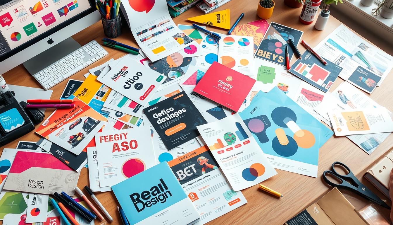
Tips for Designing the Perfect Leaflet & Flyer Printing
Leaflets and flyers are great for promoting businesses, events, or products without spending a lot. They can be used for many things, like promotional flyers, mailers, brochures, and posters. To make them effective, you need to know who you’re talking to, what you want to achieve, and how to make them look good. Think about who you’re trying to reach, what you want to accomplish, and how to make it visually appealing. These are the key things to keep in mind when designing leaflets and flyers. Key Takeaways Leaflets and flyers are versatile print marketing tools for promoting businesses, events, or products. Effective design requires understanding the target audience and campaign objectives. Visual appeal, including eye-catching headlines and high-quality images, is crucial for capturing attention. Consistent branding and strategic use of white space can enhance the overall design. Careful consideration of printing and distribution methods can maximize the impact of leaflets and flyers. What are Leaflets and Flyers? Understanding the Difference Between Leaflets and Flyers Leaflets and flyers are both useful for marketing. But they have different uses. Leaflets are folded ads that promote businesses, events, and products. They have more detailed content, letting businesses share a lot with their audience. Flyers, on the other hand, are like promotional flyers but focus more on visuals. They use images or logos to catch the eye, rather than lots of text. The main difference is in the content. Leaflets have more pages and detailed info. Flyers are single-page and focus on visuals to grab attention. Knowing this helps in designing marketing materials for your business or event. Leaflets are folded printed ads used to promote businesses, events, and products Flyers are similar to promotional flyers but focus more on visuals like images or logos Leaflets have more pages and detailed content, while flyers are typically single-page with a stronger visual focus Understanding the difference between leaflets and flyers is important for creating effective marketing materials Choosing between a leaflet or flyer depends on your message and audience. Make sure your marketing materials communicate well and grab attention. Knowing the unique features of each helps you decide the best marketing strategy. Importance of Audience and Campaign Objectives Creating a great leaflet or flyer starts with knowing your audience well. You need to understand their age, interests, and what they need. This way, you can make content and visuals that speak to them and solve their problems. It’s also key to know what you want to achieve with your campaign. Do you want more people to visit your store, check out your website, or ask about your products? Your message and call-to-action should match these goals. Showing how your brand can solve their problems makes your leaflet or flyer even more effective. Key Considerations Importance Target Audience Knowing who you’re talking to is crucial. It helps you create content and visuals that grab their attention. Campaign Objectives Being clear about what you want to achieve shapes your message and call-to-action. Brand Positioning Showing how your brand solves their problems can make your leaflet or flyer much more effective. By focusing on these key points, you can make a leaflet or flyer that really works. It will grab your audience’s attention and get them to act, helping you meet your campaign goals. Designing the Perfect Leaflet: Tips for Effective Flyer Printing Making a leaflet or flyer that grabs attention is key to any marketing plan. It doesn’t matter if you’re promoting a business, event, or product. The design and layout of your materials can make a big difference. By following some simple rules, you can make leaflets and flyers that really get noticed and share your message well. Prioritize Layout and Visuals Your leaflet or flyer should be easy to look at and understand. Use lots of white space to keep things balanced and let important info pop. Add top-notch visuals, like great images or graphics, to make your flyer look better and show off your brand. Craft Concise and Compelling Content When writing your leaflet or flyer, keep it short and to the point. Share the main points, like what you’re offering and how to get it. Don’t fill it up with too much text. Too much can confuse and lose the reader’s interest. Maintain Consistent Branding Make sure your flyer looks like it belongs with your brand. Use your brand’s color scheme and visual style. This will help people recognize your brand and make your flyer look professional. Promotional Flyers Mailers Brochures Posters Flyers Highlight product/service strengths Sent directly to customers Provide detailed information Large-format for public display Focus on visuals like images or logos By following these design tips, you can make leaflets and flyers that really grab people’s attention. They’ll help share your message and show off your brand. With some careful planning and focus on the details, your printed materials can be a strong tool in your marketing strategy. Eye-Catching Headlines and Visuals Crafting Attention-Grabbing Headlines and Using High-Quality Images Grabbing the reader’s attention is key for a great leaflet or flyer. The headline should be bold and clear, using simple words to catch the eye. High-quality images and graphics are also vital. They make the flyer look good and help people remember your brand. Choosing the right size, like A5, is important. Knowing who you’re talking to helps you design better. A catchy headline can make people want to read more. Using whitespace makes your flyer easier to read. Pick fonts that work well together. Using the same branding elements in your flyer makes it instantly recognizable. Eye-catching images can make people remember your flyer more than text. Studies show that using visuals can increase interest by up to 90%. High-quality images can even get 40% more attention than text-only flyers. “Bright, bold colors are appealing to students, and simple clean designs with soft color schemes are favored by middle-aged individuals.” Make headlines bigger than the rest of the text to stand out. Whitespace helps organize your flyer, … Read more


