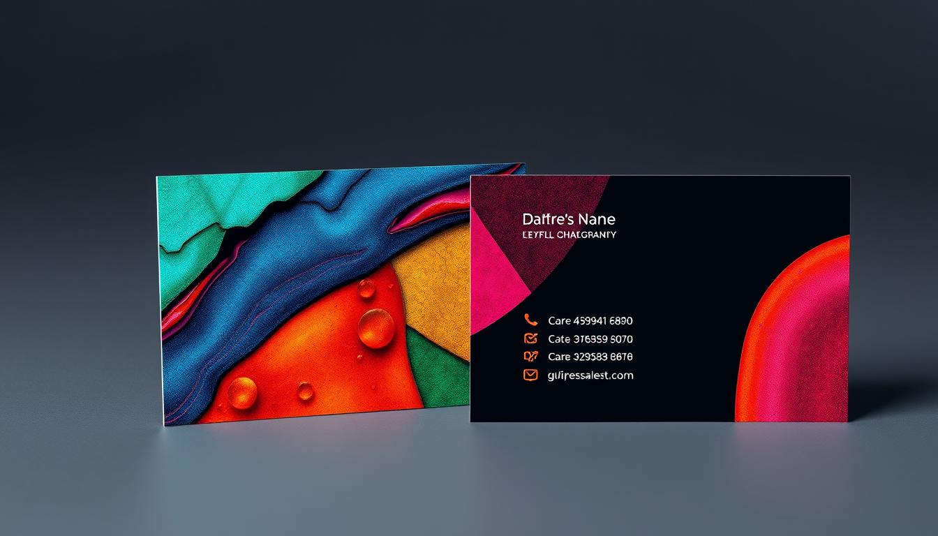
10 Tips for Designing the Perfect Business Card
Designing and printing business cards is easy, but they do more than share contact info. They show what your brand is all about. If you’re new to business card design, the final product might not match what you imagined. As a small business, you need tips to make a card that reflects your brand’s unique identity. Using a reliable service like Printing.com.sg can help you create the perfect card. To design a great business card, you must know what makes a good one. Key Takeaways Designing a business card is crucial for creating a lasting brand impression. Understanding the qualities of a good business card is essential for an effective design. Leveraging professional printing services can help achieve the desired business card outcome. Following design best practices, such as using legible fonts and CMYK color mode, is important. Aligning the business card design with existing brand materials enhances brand consistency. Understand the Qualities of a Good Business Card A well-designed business card is a powerful tool in marketing and networking. It shows your brand, professionalism, and identity quickly. When making the perfect business card, focus on two main things: showing your brand image and standing out in your industry. Conveys Your Brand Image at a Glance The size, shape, color, card stock, text, and texture of your business card tell a lot about your company. A full-color, high-quality card shows you care about details and quality. The right design, color, and texture can make your card stand out, leaving a strong impression on others. Distinguishes You by Industry Design your business card with your target audience in mind. The rule “less is more” is key in business card design. You want a card that looks good and is easy to understand. A good design connects with customers quickly, strengthening your brand story and chances of making a good impression. By knowing what makes a successful business card, you can create a marketing material that shows your visual communication and graphic design. It also helps you stand out in your industry. A well-made business card can be the first step to new opportunities. Study Business Card Designs Across Industries Designing the perfect business card starts with market research. Look at the best designs from different industries. Lay them out and see what you like and dislike. Also, check out your competitors’ cards to spot industry trends and unique qualities. By doing a competitive analysis, you can decide if you want to beat or be different from others. It’s better to surpass some qualities to make your business card design stand out. Recent studies show popular trends in business card designs include: Vibrant color block designs Sleek, modern layouts with a silk finish aesthetic Artistic use of geometric patterns and abstract shapes Creative typography featuring unusual font pairings Full-bleed photo backgrounds High-contrast designs using stark black and white Illustrated designs featuring hand-drawn elements Watercolor splash designs Retro-inspired designs Studying these top business card designs can give you great ideas. You can create a card that truly impresses your audience. “Businesses that hand out more than 2,000 business cards per month experience a 25% increase in overall sales.” – Small Business Trends Align Your Business Card with Existing Brand Materials When you design your business card, make sure it matches your brand’s colors, fonts, and logo. These elements should be the same in your website, marketing materials, and other public platforms. Keeping your brand consistency is key to your card’s design. Consistent Color Scheme, Fonts, and Logo Your business card should look like your brand. Use the same colors, fonts, and logo as in your branding and print design. This makes your brand easy to recognize and memorable. Printing.com.sg has many options for making your cards stand out. They offer thick, premium card stocks that last. Their wide range of printing services ensures your card fits perfectly with your brand materials. “Consistency is key when it comes to building a strong brand identity. Your business card should seamlessly integrate with your other branding elements.” Apply Basic Design Principles When designing your business card, it’s key to follow basic graphic design principles. This ensures your card looks good and represents your brand well. Make sure there’s enough space around your card, at least 5mm from the edge. This helps your card print well and makes your info easy to read. Also, focus on the typography on your card. Choose a font size that’s big enough, like a minimum of 8-point. Pick the CMYK color mode for the best print quality. To make your card look balanced and nice, use grid systems. This helps arrange your card’s elements well. It keeps your card looking professional and put together. Design Principle Recommendation Importance Margin Space Minimum 5mm from edge Ensures high-quality reproduction Font Size Minimum 8-point Ensures legibility Color Mode CMYK Optimizes printing quality Layout Use grid systems Maintains information hierarchy and alignment By using these basic print design rules, you can make a business card that shows off your brand. It will also make a strong impression on anyone who sees it. “Successful design is not the achievement of perfection but the minimization of the imperfection.” – Dieter Rams Choose the Right Size and Shape In the world of business card design, the standard size of 3.5″ x 2″ is common. But, Printing.com.sg suggests trying custom shapes to stand out. A unique shape can make your brand identity memorable. While a traditional rectangular card is safe, think about a vertical layout. It can make your business card unique and memorable. Card Size Advantages Considerations Standard (3.5″ x 2″) Widely recognized and accepted Cost-effective to print Fits easily in wallets and card holders Can be easily overlooked in a stack of cards Limited space for design and information Custom Shapes Aids in brand recognition and differentiation Allows for more creative and memorable designs Enhances the overall visual communication of your brand May be more expensive to produce Can be less practical for storage and organization … Read more


