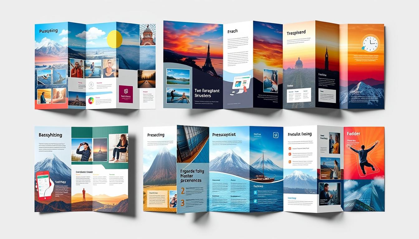
Unlocking Brochure Design: The Fold’s Importance
In today’s digital world, physical marketing materials like brochures still hold their ground. They let businesses connect with customers in a real way. Brochures are great because they pack a lot of information into a small space. The success of a brochure depends on many things. This includes the paper used and how it’s folded. Knowing about different papers helps make the brochure look good and work well. Matching the brochure’s look with its goals is important for success. The fold is at the heart of a great brochure. It affects how the brochure looks and how well it grabs the audience’s attention. There are many folding styles, like tri-fold and gate-fold, that can make a brochure stand out. Key Takeaways Brochures offer a tangible way for businesses to engage with their customers, allowing for physical interaction with the brand. The choice of paper stock, including matte vs. glossy and lightweight vs. heavyweight, significantly impacts the overall aesthetics and effectiveness of a brochure. The fold of a brochure is a critical element that can maximize impact and engagement with the audience, with various techniques like tri-fold, gate-fold, and booklet-style perfect-bound. Aligning the physical attributes of the brochure with the project’s objectives and desired visual impact is key to unlocking the true potential of print marketing. Exploring the versatility of brochure design and folding techniques can lead to attention-grabbing layouts that effectively convey the brand’s message and captivate the reader. The Enduring Relevance of Brochures in the Digital Age In today’s digital world, brochures still stand strong as a key marketing tool. They’ve evolved in size, design, and layout with the digital age. Yet, physical brochures remain a favorite for businesses of all sizes. In fact, up to 79% of small to medium-sized enterprises in the U.S.A. use brochures to share their brand’s identity and values. Brochures as a Tangible Brand Statement Brochures act as a real-life statement of a company’s brand. They show professionalism, mission, and what makes a brand unique through design. The feel of a brochure is unique and can’t be matched by digital ads, making them valuable in our virtual world. The Transition to Digital and Its Impact The move to digital brochures has changed their size, colors, and layout. But, physical brochures are still a top choice for businesses. Over 500 ambitious brands have worked with Superside, a leading design agency. Collabera’s 90-page brochure shows the lasting appeal of print marketing. Brand Brochure Design Approach Key Highlights IKEA Annual brochure presenting new product collection Caters to home décor, fashion, and beauty brands Disneyland Digital brochure balancing imagery and text Effective digital brochure design Tiffany & Co. Minimalist design with classic fonts and high-quality visuals Conveys brand elegance and exclusivity FujiFilm Focus on product features and actual product images Showcases innovative brand identity Accenture Bold colors, maxi typography, and contrasts Highlights core brand values Louis Vuitton Elegant and striking design with brand icons and consistent color palette Conveys luxury and exclusivity The catalogue market is expected to hit $335.62 billion by 2030. This shows the growing need for well-designed brochures. Businesses that invest in quality brochures often see big returns. Brochures are a cost-effective way to engage customers and boost sales. Brochure Design Trends for 2024 Marketing is changing, and so is brochure design. In 2024, expect to see modern, minimalist designs. These will feature bold colors, striking typography, and beautiful images. Minimalism is big in 2024 brochure design. Minimalist design is all about simplicity, focusing on the main message and visuals. Clean layouts and negative space add elegance and sophistication. Typeface pairing is another trend. Pairing bold headlines with legible body fonts creates a balance. Serif and sans serif fonts together make for a striking design. High-quality images are key in brochure design. Images help convey the message clearly, grabbing the audience’s attention. Brands use professional photos that match their identity and appeal to their audience. Color schemes are also important. Blue is trusted, red is energetic, and green is natural, perfect for eco-friendly brands. Colors should match the brand and evoke the desired emotions. Innovative design techniques are becoming more common. Techniques like embossing and foil stamping add luxury, while new folds and cuts make brochures more engaging. In summary, 2024 brochure design trends focus on making a strong impression. Modern, minimalist designs with bold colors, typography, and images are key. By following these trends, businesses can enhance their branding and connect with their audience. The Art of Paper Selection Choosing the right paper is key to a great brochure. The mix of matte and glossy papers, along with the paper’s weight and thickness, greatly affects your brochure’s look and feel. Matte vs. Glossy: The Aesthetic Dilemma Matte paper gives a classy, subtle look. It’s perfect for brochures and business cards where you want to focus on the text. Glossy paper, on the other hand, makes colors pop. It’s great for eye-catching magazine covers and posters. Weight Matters: Navigating Paper Thickness The paper’s weight is crucial for your brochure’s quality. Light paper (74Lb and below) is good for flyers and everyday documents. Medium paper (80Lb-60Lb) is best for brochures and presentations, offering a mix of strength and flexibility. Heavy paper (100Lb and above) is best for durable items like business cards and high-quality prints. Choosing the right paper is all about matching the paper’s features with your project’s goals and style. By picking the right paper, you can make a brochure that grabs attention and shows off your brand’s professionalism. Paper Type Recommended Use Key Characteristics Lightweight Paper (74Lb and below) Everyday printing needs like flyers and standard documents Lightweight, economical, suitable for basic printing Mediumweight Paper (80Lb-60Lb) Brochures, presentations, and other marketing materials Balanced sturdiness and flexibility, suitable for more dynamic projects Heavyweight Paper (100Lb and above) Business cards, postcards, and high-quality prints Durable, luxurious feel, ideal for prestigious and long-lasting items Coated vs. Uncoated Paper: Understanding the Difference Choosing between coated and uncoated paper for your brochure design is crucial. It affects … Read more


