
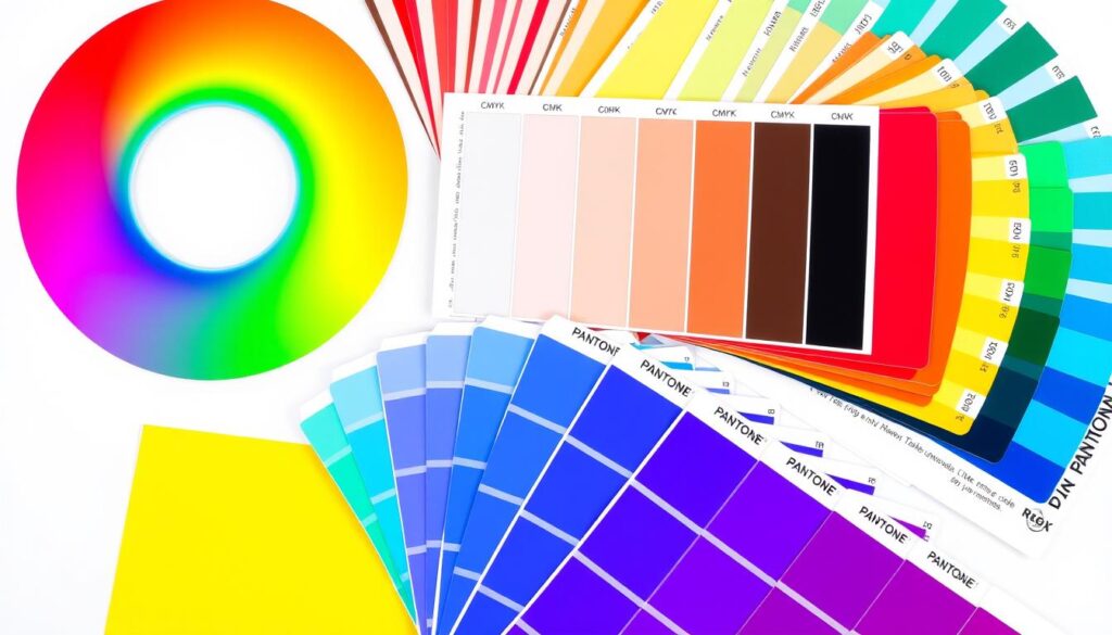
In the world of design, knowing about color is key. RGB, CMYK, and PMS are terms that often confuse clients and designers. These color models are vital for getting colors right across different platforms and mediums.
RGB, or Red, Green, and Blue, is for digital screens like computers and phones. It’s how colors show up on our screens. CMYK, or Cyan, Magenta, Yellow, and Black, is for printing. The Pantone Matching System (PMS) is like the “Haute Couture of Colors.” It gives each color a unique number for exact color matching, especially in branding and logos.
It’s important for designers, printers, and clients to know about these color models. This ensures that the final product, like a website or brochure, looks as intended. It helps keep the brand’s visual identity consistent.
Key Takeaways:
- RGB, CMYK, and PMS are the three primary color models used in design and printing.
- RGB is the color model for digital displays, while CMYK is the standard for printing.
- PMS provides a precise color matching system, making it popular for branding and logo design.
- Knowing when to use each color model is essential for achieving accurate color representation across different platforms.
- Consistent color management is crucial for maintaining brand identity and visual consistency.
Understanding Color Models: Digital vs Print
The color model you pick can really change how your design looks. RGB is for digital, and CMYK is for print. Knowing how each works is key to getting colors right everywhere.
RGB: The Digital Dynamo
RGB is the heart of digital design. It mixes red, green, and blue light to show bright colors on screens. This makes it perfect for digital stuff like websites and ads. RGB color profile consists of Red, Green, and Blue hues that combine to create extensive variations of colors and exists exclusively in screen displays like computer monitors and mobile screens.
RGB color profile uses additive processes to produce colors by blending light and provides a larger gamut than CMYK. Adobe Illustrator shows how RGB colors mix to make different shades. It’s great for creating eye-catching designs.
CMYK and PMS: Print Perfection
For print, CMYK and Pantone Matching System (PMS) are the go-tos. CMYK mixes cyan, magenta, yellow, and black inks to print colors. CMYK color profile contains Cyan, Magenta, Yellow, and Black that combine to produce a range of hues and is used for printed designs like business cards, flyers, posters, and packaging.
PMS is for matching colors exactly, which is great for brands. It is advised to set documents to CMYK before printing to prevent color inconsistencies between RGB and CMYK equivalents.

“Understanding the differences between these color models is crucial for ensuring consistent and accurate color reproduction across digital and print platforms.”
Mastering RGB: The Red, Green, Blue Trio
The RGB color model is at the core of digital design. It’s key for web design and digital art. This “additive” color system mixes red, green, and blue to create many colors.
In RGB, each color has a value from 0 to 255. A higher value means a brighter color. Mixing all colors at 255 gives us white. Without any, we get black.
This system is vital for web-safe colors. It helps colors look the same on different digital platforms. By understanding RGB, designers can make their rgb color, web design, and digital design projects pop. They use color theory to grab their audience’s attention.
“The RGB color model is the foundation of the digital world, allowing designers to create a symphony of colors that captivate the senses and leave a lasting impression.”

Knowing RGB is essential for digital designers. It helps them make bright, eye-catching digital experiences. With this knowledge, designers can explore new creative paths and improve their web design and digital design work.
Cracking the CMYK Code: Cyan, Magenta, Yellow, Black
In the world of print design, the CMYK color model is key. It stands for Cyan, Magenta, Yellow, and Black. This “subtractive” color system creates a wide range of colors by layering these four primary colors.
CMYK Color Representation
The CMYK color model mixes different percentages of the four ink colors. When all four are combined, they make a deep black. But, adjusting each color lets designers create a wide range of print design options, from soft pastels to bright colors.
The Difference Between Black and Rich Black
CMYK printing uses a single “key” (black) ink. But, there’s a big difference between regular black and “rich black.” Regular black uses 100% black (K) ink. Rich black combines all four CMYK colors, making a deeper, richer black.
Knowing the CMYK color model and the difference between black and rich black is vital. It helps designers manage cmyk color in the print design world. By understanding these, designers can make sure their colors look great in all printed materials.
Unveiling the Pantone Matching System (PMS)
In the world of print design, the Pantone Matching System (PMS) is key. It ensures colors are precise, helping designers keep colors consistent everywhere. This is crucial for matching colors across different platforms and mediums.
The Haute Couture of Colors
The PMS is like the “haute couture” of colors. It offers a wide range of pre-mixed, opaque inks for “spot colors.” This means designers can use metallic and fluorescent shades that CMYK can’t match. Pantone’s focus on color excellence makes it vital for branding and packaging where exact color matching is a must.
Pantone Color Bridge: Bridging the Digital-Print Gap
The Pantone Color Bridge is a vital tool for designers. It connects digital and print colors, ensuring colors on screens match those on paper. This avoids costly color mistakes and keeps designs consistent.
Thanks to the Pantone Matching System and the Color Bridge, designers can work confidently with colors. They can ensure their pantone matching system, spot color, print design, branding, and color consistency are perfect from start to finish.
“Pantone colors are the haute couture of the design world, offering unparalleled precision and a vast array of options that elevate any project to new heights.”
RGB vs CMYK vs PMS: Deciphering Design’s Confusing Color Jargon
As a designer, understanding color models and terminology can be tough. RGB, CMYK, and PMS are key color systems for different design needs. Knowing when to use each is vital for great print and digital projects.
RGB, or Red, Green, and Blue, is for digital designs like web pages and ads. It shows over 16 million colors well on screens. But for printing, CMYK, with Cyan, Magenta, Yellow, and Black, is the norm. It ensures colors look right on paper and other physical materials.
For exact color matches, Pantone Matching System (PMS) is the best choice. It has thousands of pre-made ink colors. This is key for keeping brand colors consistent.
Switching colors between models can be tricky. The same color might look different because of how colors are handled and printed. It’s important to explain these differences to clients to manage their expectations.
Designers need to know the strengths and limits of each color model. This helps them choose the right one and work well with clients. Learning about rgb vs cmyk vs pms, color models, and design jargon is essential for success in print design and web design.
Color Consistency: The Importance of Printer Coordination
Keeping colors the same across different prints is key for a strong brand image. Designers and printers work together with trusted vendors like Printing.com.sg. This ensures colors are accurately reproduced, no matter the print vendor. This teamwork helps avoid color differences in prints, which can harm a brand’s look.
Good printer management and design-print workflow are vital for color consistency. Printers and designers must match color models like RGB, CMYK, or PMS. This ensures the brand’s colors stay true, making sure printed materials match the brand’s look.
This teamwork helps brands avoid costly reprints and ensure a seamless, consistent visual experience for customers. Investing in printer coordination and color management boosts print quality. It also makes the brand look more professional and credible to its audience.
“Consistent color is not just a nice-to-have, but a must-have for any brand that wants to maintain a strong, cohesive visual identity across all its printed materials.”
In today’s market, where looks and brand recognition matter a lot, color consistency and print coordination are crucial. By focusing on these, brands can make sure their printed materials always show the right color palette and branding. This builds trust and recognition with their audience.
| Color Model | Primary Use | Key Considerations |
|---|---|---|
| RGB | Digital displays (e.g., computers, TVs) | Vibrant colors, but challenging to translate to print |
| CMYK | Printing industry | Industry standard, but limited color range compared to RGB |
| PMS | Printing industry | Precise color matching, but requires specialized printing techniques |
Choosing the Right Color Model: A Strategic Approach
Choosing the right color model is key in design. It affects the final look of your work, whether it’s for the web, print, or branding. Knowing RGB, CMYK, and PMS is crucial for the best results.
When to Use RGB
RGB (Red, Green, Blue) is best for digital designs. It offers millions of colors, perfect for web pages, digital screens, and social media. RGB brings out the full range of colors on computer and mobile screens, making your online presence pop.
When to Use CMYK
For print, CMYK (Cyan, Magenta, Yellow, Key [Black]) is the top choice. It’s great for business cards, brochures, magazines, and other print materials. CMYK ensures colors look good on different materials, even though it has a narrower range than RGB.
When to Use PMS
Pantone Matching System (PMS) is best for branding and logos. PMS colors are precise and consistent across various mediums. For maintaining color accuracy and consistency, like in corporate identities or custom-printed items, PMS is the best choice.
Choosing the right color model is a strategic decision. It depends on the project’s use and desired outcome. By understanding each model’s strengths and weaknesses, designers can make choices that improve visual appeal, maintain brand consistency, and achieve the best results.
“Proper color mode selection can enhance visual appeal, improve color accuracy, save time, and increase professionalism in design work.”
Branding and Color: Maintaining Consistency Across Platforms
Creating a strong brand means setting clear color rules. It’s important to use the same colors online and in print. By picking the right RGB, CMYK, and PMS colors, brands stay true to themselves everywhere.
Working with a design agency like Printing.com.sg is key. They help make sure your brand’s colors are right in all your marketing. This is crucial for a strong, branded look.
Following brand guidelines helps mix digital and print smoothly. This way, brands offer a consistent and attractive experience to their customers.
A consistent color scheme is a sign of a great brand. By managing colors well, businesses can build a unique and unified look. This look connects with their audience everywhere.
Color Management: Ensuring Accurate Representation
Getting the colors right is key to making sure printed materials look as the designer intended. This means using color management to calibrate devices. Working with a trusted print partner helps keep the color management smooth. This way, the printed materials show the colors as they should.
Understanding color models is crucial for color management. The RGB model is for digital screens, while CMYK is for printing. The Pantone Matching System (PMS) offers specific ink colors for logos and brand colors.
To get color accuracy right, designers should start with PMS colors. Using color swatches in design software keeps colors consistent. Also, calibrating monitors and printers is key to matching digital and physical outputs.
| Color Model | Applications | Key Considerations |
|---|---|---|
| RGB | Digital displays, websites, apps | Suitable for digital applications, but not ideal for print |
| CMYK | Printing, brochures, business cards, packaging | Suitable for print materials with four or more colors, but may not accurately represent some tones |
| PMS | Logos, branding, packaging | Provides precise color matching, but can be more expensive than CMYK |
By grasping color management and teaming up with a reliable print partner, designers can make sure their printed work looks as they envisioned. This boosts the brand’s image for everyone who sees it.
Conclusion
In the world of design, knowing RGB, CMYK, and PMS color models is key. This knowledge helps in creating top-notch designs for digital or print projects. Designers and their clients can then show off colors that pop and look great everywhere.
Working with a reliable print service like Printing.com.sg makes color management easier. They help designers meet brand color standards. With Pantone’s 1,000 ink colors, CMYK’s flexibility, and RGB’s brightness, picking the right color model is crucial. This ensures designs look professional and impactful.
As design evolves, designers need to keep learning about color management. Tools like the Pantone Color Finder and RGB/CMYK to PMS web tool are essential. They help designers create stunning, color-accurate work. This boosts their reputation as true design experts.
FAQ
What is the difference between RGB, CMYK, and PMS color models?
RGB (Red, Green, Blue) is for digital design, using light to mix colors. CMYK (Cyan, Magenta, Yellow, Black) is for print, using inks. PMS (Pantone Matching System) offers precise colors for branding and logos.
When should I use RGB, CMYK, and PMS?
Use RGB for digital and web design for vibrant colors. CMYK is best for print for accurate colors. PMS is for branding and logos for exact color matching.
What is the difference between black and rich black in CMYK?
Regular black in CMYK is 100% K (black). Rich black combines all four CMYK colors for a deeper black.
What is the Pantone Color Bridge and how does it help with color consistency?
The Pantone Color Bridge matches digital and print colors. It helps designers match PMS colors to CMYK and RGB, ensuring colors are consistent everywhere.
Why is color consistency important for branding and how can it be maintained?
Keeping brand colors the same is key for a strong visual identity. Use specific RGB, CMYK, and PMS values. Work with a trusted print partner for accurate colors.
How can color management practices help ensure accurate color representation in print?
Good color management means calibrating devices for consistent colors. Working with a trusted print partner ensures your colors look great in print.
Resources
Explore our curated list of recommended resources for printing, design, and free media assets. Whether you need professional printing services, free design templates, or royalty-free photos for your next project, these reliable sites have you covered.
1. Printing & Design
- Printing Inc.
Description: Singapore-based online printing service offering a variety of print products such as business cards, flyers, brochures, and custom stickers with professional design services. - Namecards Inc.
Description: Specialist in name card printing, providing a wide range of custom designs, finishes, and materials for high-quality business cards. - Kian Hong Press
Description: Established corporate printing company in Singapore, offering solutions for brochures, catalogs, annual reports, and other corporate stationery.
2. Free Design Templates
- Canva
Description: Offers a wide range of free and customizable templates for various needs, including presentations, posters, social media, and marketing materials. - FreePik
Description: Provides thousands of free and premium templates for brochures, flyers, business cards, and more, along with editable vector illustrations and graphics. - Piktochart
Description: Focused on data visualization and professional templates for infographics, posters, presentations, and reports, with both free and premium options.
3. Free Royalty-Free Photos
- Pexels
Description: Offers high-quality, free stock photos and videos shared by talented creators for commercial and personal use without attribution. - Unsplash
Description: A large collection of beautiful, high-resolution images contributed by photographers worldwide, available for free use in any project. - Pixabay
Description: A community-driven platform offering copyright-free photos, illustrations, and videos for use in any creative project, with no licensing restrictions.
