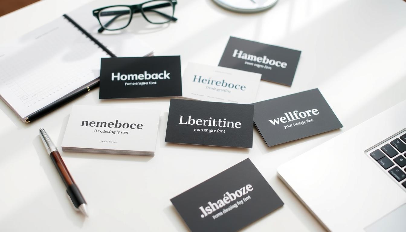
Making a strong impression with your business card is key in today’s world. The font you choose is very important. It helps show your brand and professionalism to others. In this guide, we’ll look at the top 10 professional fonts for stunning business cards.
Choosing the right font is crucial, no matter if you’re starting up or are an experienced business leader. We’ll cover fonts from clean sans serifs to classic serifs and unique scripts. These fonts will help show your brand’s personality and make your cards look great.
Key Takeaways
- Discover the top 10 professional fonts that will make your business cards stand out.
- Learn how to balance readability and visual appeal on the small canvas of a business card.
- Understand the impact of typography on your brand identity and the importance of font selection.
- Explore the unique characteristics and use cases of various font categories, including sans serifs, serifs, and scripts.
- Gain insights on optimizing font choices for different printing techniques and digital platforms.
The Importance of Choosing the Right Font for Business Cards
Choosing the right font for business cards is key. It shapes how people see your brand. Typography shows your company’s professionalism and values. It’s important to find a font that’s easy to read and looks good, as space is limited.
Understanding the Impact of Typography on Brand Identity
The font on your business card matters a lot. Sans serif fonts like Helvetica Neue and Arial look modern and professional. Serif fonts, such as Times New Roman and Baskerville, suggest tradition and sophistication. The font can also show your brand’s personality, from friendly to formal.
Balancing Readability and Visual Appeal on a Small Canvas
Business cards are a special challenge for typography. You need to make sure the text is clear and the design is appealing. Fonts like Futura and Myriad Pro are good choices because they’re easy to read and look good. Script fonts, like Manus and Fabfelt Script, add a personal touch but should be used carefully to stay readable.
| Font | Characteristics | Suitability for Business Cards |
|---|---|---|
| Helvetica Neue | Diverse character weights, versatile | Consistent, professional, and modern |
| Manus | Handwritten script aesthetic | Elegant and personal touch, larger point size recommended |
| Gotu | Elegant and professional with a twist | Sophisticated and attention-grabbing design |
“The font on a business card can make or break the overall impression it leaves on the recipient.”
Choosing the right font for your business card is crucial. It should match your brand’s identity and message. By picking a font that’s both readable and visually appealing, you can make a lasting impression and build strong brand recognition.
Sans Serif Fonts: Clean, Modern, and Professional
In the world of business card design, sans serif fonts are a top pick. They are known for their clean, modern, and professional look. These fonts are sleek and streamlined, fitting well with many branding styles. They help make a strong impression.
Helvetica: The Epitome of Minimalist Elegance
Helvetica is a famous sans serif font, loved by designers and businesses. It has balanced proportions and a neutral tone. This makes it sophisticated and timeless. Big brands like Spotify, Airbnb, and Mastercard use it for its modern and professional vibe.
Arial: The Versatile and Readable Choice
Arial is another great sans serif font for business cards. It’s easy to read and fits many design styles. Its open letterforms and clear structure make text clear, even on small cards. It’s good for many industries and designs.
Sans serif fonts like Helvetica and Arial are popular for business cards. They offer a clean, modern, and professional look. These fonts are sleek and streamlined, perfect for designs that aim to impress.
| Font | Attributes | Use Cases |
|---|---|---|
| Helvetica | Minimalist elegance, balanced proportions, neutral tone | Prestigious brands, modern and professional designs |
| Arial | Highly readable, open letterforms, clear structure | Corporate, creative, and diverse industry applications |
“Sans serif fonts offer a clean, modern, and professional aesthetic that complements various branding styles.”
Serif Fonts: Timeless Classics with a Traditional Touch
Serif fonts, like Times New Roman, are still popular for business cards. They offer a classic look that adds a touch of tradition. This makes them a great choice for professional branding.
Times New Roman: Simple, Sophisticated, and Enduring
Times New Roman has been around since the mid-1800s. Its lasting appeal shows its elegance and versatility. It’s known for its clean lines and subtle serifs, making it perfect for professional settings.
The article notes Times New Roman’s wide use in magazines, books, and newspapers. This solidifies its status as a reliable and timeless font. It’s a top pick for businesses wanting a polished, traditional look.
| Font | Characteristics | Recommended Uses |
|---|---|---|
| Times New Roman | – Classic serif font with clean lines and subtle serifs – Conveys a sense of professionalism and authority – Widely used in print media |
– Formal documents – Printed materials – Business cards – Branding with a traditional touch |
As the article points out, serif fonts like Times New Roman are great for business cards. They help companies look professional and sophisticated. Using traditional serif fonts can make a strong impression and build a strong brand identity.
Script Fonts: Adding a Personal and Artistic Flair
Script fonts bring a personal touch to business cards. They mimic handwriting, making cards stand out. They’re perfect for small business owners, creatives, and entrepreneurs to show their brand’s unique side.
Script fonts are versatile. They work well in both formal and casual settings. Fonts like Angelina and Neon Planet offer a wide range of styles to match any brand.
Using script fonts can make your business cards more eye-catching. They’re great for headings, logos, or body text. Pairing them with other fonts can create a design that truly shows off your brand.
Script fonts can show off your brand’s style, whether it’s fancy or casual. They help your business cards make a memorable impression. This can help your brand stand out in a busy market.
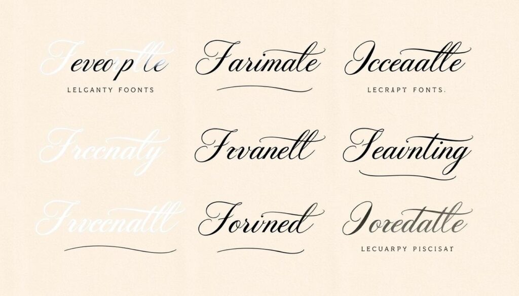
Choosing script fonts for your business cards shows what your brand is all about. Think about the look, readability, and design. This way, you can make a business card that truly represents you and your brand.
Top 10 Professional Fonts for Stunning Business Cards
Choosing the right font for your business cards is crucial. It can make a big difference in how people see your brand. Here, we’ll look at 10 top fonts that can make your business cards stand out and help establish your brand.
Baskerville: Old-School Elegance with Modern Readability
Baskerville is a classic serif font that looks timeless. It was designed in 1757 and has a modern feel. Its clean lines and balanced look make it perfect for business cards, adding a touch of class to your brand.
Futura: Geometric Shapes and Modernity
Futura is a sans-serif font that’s been popular for years. It has a modern look with geometric shapes. This font works well in both formal and casual settings, making it great for different types of business cards.
Myriad Pro: Apple’s Sleek and Open Letterforms
Myriad Pro is a sans-serif font loved by many, especially after Apple adopted it. It has clean, open letters and elegant proportions. This font is versatile and can make your business cards look sophisticated and tech-savvy.
Leyton: Opulent and Luxurious Embossed Look
Leyton is a font that screams luxury and elegance. Its embossed look is perfect for high-end business cards. It adds a touch of sophistication and exclusivity to your brand, making it great for finance, law, or luxury goods professionals.
Black Caviar: Handwritten Charm for a Personal Touch
Black Caviar is a script font that adds a personal touch to business cards. Its organic strokes give a warm and approachable feel. It’s perfect for entrepreneurs, creatives, or service-based businesses who want to connect with clients on a personal level.
| Font | Characteristics | Best Suited For |
|---|---|---|
| Baskerville | Classic serif, elegant, and readable | Formal, traditional, and professional industries |
| Futura | Modern, geometric sans-serif, versatile | Wide range of industries, from tech to luxury |
| Myriad Pro | Sleek, open letterforms, highly legible | Tech, finance, and modern professional sectors |
| Leyton | Opulent, embossed look, luxurious | High-end, exclusive, and premium brands |
| Black Caviar | Handwritten script, personal, and artistic | Entrepreneurs, creatives, and service-based businesses |
Selecting the Perfect Font Size for Business Cards
Choosing the right font size for business cards is key. It affects how easy the text is to read and the card’s look. Finding a balance between these two is crucial for making a good impression.
Balancing Legibility and Visual Impact
Experts say the best font size for business cards is between 10 point and 16 point. This size makes important info like your name easy to read. Smaller text, like phone numbers, can be a bit smaller but still clear.
Use 10-16 point for main text like your name or company name. For less important info, like phone numbers, go for a smaller size but not less than 8 point. Some fonts, like script and serif, might look smaller and harder to read at 8 point.
Sans serif fonts are better for small sizes because they’re easier to read. The goal is to pick a size that fits all the info without being too crowded. It should also be big enough to look professional and easy to read.
| Text Type | Recommended Font Size |
|---|---|
| Primary Information (Name, Company) | 10-16 point |
| Secondary Information (Contact Details) | 8-12 point |
The right font size for your business card is important. It affects how well people can read it and how it looks. This, in turn, shows how professional and detail-oriented your business is.
Print vs. Digital: Considering the Medium
Choosing the right font for business cards depends on the medium. Whether it’s print or digital, the font should look good and be easy to read. It’s also important to make sure the font works well on digital platforms, as cards might be shared online.
Optimizing Font Choices for Different Printing Techniques
The type of printing affects your business card’s look and feel. For example, thin fonts might not work well with offset printing. But bold fonts can look blurry on digital prints. Picking the right font for your printing method helps show off your brand clearly.
Ensuring Compatibility and Readability on Digital Platforms
Today, business cards are often seen on screens, not just in hand. So, it’s key to pick fonts that look good on phones and tablets. Think about font size, spacing, and how well they read on small screens. This way, your card will make a strong impression, whether given out or shared online.
| Printing Technique | Optimal Font Characteristics |
|---|---|
| Offset Printing | Bolder, thicker fonts with higher contrast for better visibility |
| Digital Printing | Fonts with clean, crisp lines and uniform weight to prevent blurring |
| Embossing | Fonts with distinct, legible shapes that can withstand the embossing process |
“Choosing the right font for your business card can make a significant difference in how your brand is perceived. It’s about finding the perfect balance between visual appeal and practical readability.”
By thinking about print and digital needs, you can pick the best fonts for your business cards. This way, your cards will impress in both the real and virtual worlds.
Pairing Fonts Effectively for a Harmonious Design
Making a business card look good needs careful font pairing. Mixing serif and sans serif fonts helps create a clear layout. This guides the viewer’s eye and makes the design look good together.
Combining Serif and Sans Serif for Contrast and Hierarchy
Using a serif and a sans serif font together adds class and professionalism. Serif fonts look traditional and elegant. Sans serif fonts are modern and clean, making important info stand out.
Designers often use serif fonts for main headings or the business name. Sans serif fonts are for secondary info like contact details. This makes the design look better and easier to read.
By using serif and sans serif fonts well, designers make a business card that impresses. It looks professional and connects with the audience.
| Font Pairing | Font Combination | Suited for |
|---|---|---|
| Serif + Sans Serif | Baskerville + Lato Abril Fatface + Lato Alegreya Sans Black + Alegreya |
Formal and professional designs, marketing materials, digital agency websites |
| Cursive + Sans Serif | Pacifico + Verdana Chela One + Patrick Hand |
Casual and playful designs, retro-themed branding, kid-oriented content |
| Geometric + Slab Serif | Aqua Grotesque + Roboto Slab Thin Bebas Neue + Old Standard TT |
Futuristic-focused websites, impactful headlines, reviews and ecommerce sites |
Exploring different font combinations helps designers make striking business card designs. These designs effectively share the brand’s identity and make a strong impression.
Conclusion
Choosing the right fonts for business cards is key to making a strong impression. This article has covered various font types, from clean sans serifs like Helvetica to classic serifs like Times New Roman. It also looked at script fonts, helping readers pick the best for their designs.
When picking fonts, think about readability, looks, printing methods, and how fonts work together. Fonts like Baskerville and Futura were mentioned as great choices. They show the wide range of professional fonts available for memorable business card designs.
Choosing the right fonts is crucial for a brand’s identity and connecting with customers. Whether you’re a small startup or a big company, picking the right fonts can greatly improve your brand’s image. It can also boost customer engagement and your professional reputation.
FAQ
What are the top professional fonts for stunning business cards?
This article looks at 10 top fonts for business cards. These include Baskerville, Futura, Myriad Pro, Leyton, and Black Caviar. They can make your business cards stand out.
How does the choice of font impact a brand’s identity and perception?
The font on your business card greatly affects how people see your brand. It shows your company’s professionalism, personality, and values. It’s key to pick a font that’s easy to read and looks good.
What are the advantages of using sans serif fonts for business cards?
Sans serif fonts are popular for business cards because they look clean and modern. Helvetica and Arial are two well-known choices. They give your card a sleek look.
Why are serif fonts considered a timeless classic choice for business cards?
Serif fonts are still a classic choice for business cards. They offer a timeless elegance. Times New Roman is a great example, showing sophistication and style.
How can script fonts add a personal and artistic touch to business cards?
Script fonts can make your business cards unique and artistic. They look like handwriting, adding a personal touch. This makes your card stand out.
What is the importance of selecting the appropriate font size for business cards?
The right font size is key for business cards. It ensures your text is clear and impactful. The article suggests using font sizes between 10 pt to 16 pt. Finding the right size is important.
How do font choices differ for print and digital business cards?
Choosing fonts for business cards depends on whether they’re for print or digital. The article talks about how to pick fonts that work well for printing and are easy to read on screens.
What strategies are recommended for effectively pairing fonts on business cards?
Pairing fonts well is important for a good business card design. The article offers tips on mixing serif and sans serif fonts. This helps create a clear and balanced design.
Resources:
Explore our curated list of recommended resources for printing, design, and free media assets. Whether you need professional printing services, free design templates, or royalty-free photos for your next project, these reliable sites have you covered.1. Printing & Design
- Printing Inc. Description: Singapore-based online printing service offering a variety of print products such as business cards, flyers, brochures, and custom stickers with professional design services.
- Namecards Inc. Description: Specialist in name card printing, providing a wide range of custom designs, finishes, and materials for high-quality business cards.
- Kian Hong Press Description: Established corporate printing company in Singapore, offering solutions for brochures, catalogs, annual reports, and other corporate stationery.
2. Free Design Templates
- Canva Description: Offers a wide range of free and customizable templates for various needs, including presentations, posters, social media, and marketing materials.
- FreePik Description: Provides thousands of free and premium templates for brochures, flyers, business cards, and more, along with editable vector illustrations and graphics.
- Piktochart Description: Focused on data visualization and professional templates for infographics, posters, presentations, and reports, with both free and premium options.
3. Free Royalty-Free Photos
- Pexels Description: Offers high-quality, free stock photos and videos shared by talented creators for commercial and personal use without attribution.
- Unsplash Description: A large collection of beautiful, high-resolution images contributed by photographers worldwide, available for free use in any project.
- Pixabay Description: A community-driven platform offering copyright-free photos, illustrations, and videos for use in any creative project, with no licensing restrictions.

