In this guide, we’ll share expert tips for using Pantone colors in your design projects. You’ll learn about the Pantone color system and how to use Pantone colors in your work. This article is for graphic designers, brand managers, and print professionals. It will help you use Pantone colors to get the best results.
Key Takeaways
- Gain a deeper understanding of the Pantone color system and its importance in design and branding
- Discover effective methods for locating and utilizing Pantone color formulas and swatch books
- Learn how to seamlessly integrate Pantone colors into your design software and printing processes
- Explore the role of Pantone colors in maintaining brand consistency and visual identity
- Understand the significance of color theory and trends in working with Pantone palettes
What are Pantone Colors?
Pantone colors are a special color matching system made by Pantone LLC. They are a top name in color standards for designers. The Pantone Color System makes sure colors look the same in print and digital.
Understanding the Pantone Color System
The Pantone Color System has thousands of colors, each with its own number. These colors are made with a precise formula. This means colors always look the same, no matter where they are used.
Designers, printers, and branding experts use this system. It helps keep colors the same across different places and things.
Why Pantone Colors Matter in Design and Branding
Pantone colors are key for designers and branders for a few big reasons:
- Consistent Color Reproduction: The Pantone system lets designers pick exact colors. This makes sure their work looks the same everywhere.
- Accurate Color Communication: Pantone colors are a common language for color. This helps designers talk about colors clearly with printers, makers, and clients.
- Brand Identity: Many famous brands use specific Pantone colors. This helps them stand out and look consistent.
Knowing the Pantone Color System helps designers and branders make things that look great and are memorable. They can create visual experiences that are cohesive and striking.

Tips for Locating Pantone Color Formulas
Finding the right Pantone color for your project is key for keeping your brand looking good. There are many ways to find Pantone color formulas. This helps you work with these colors correctly.
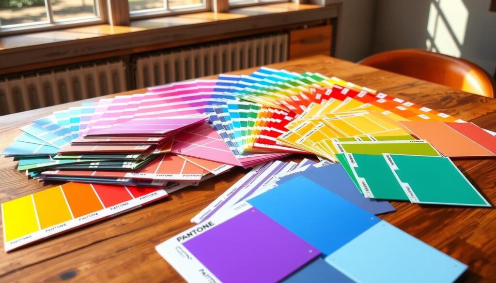
Using Pantone Swatch Books
Pantone swatch books are a must-have for designers. They have lots of color swatches that show the exact Pantone colors. This makes it easy to match colors for different projects. Getting a swatch book that fits your needs, like Pantone Fashion, Home + Interiors or Pantone Graphics, can really help your work.
Online Pantone Color Resources
There are also online tools for finding Pantone colors. Sites like the Pantone Color Institute and COLOURlovers have digital tools. They are great for working from home or when you need a color fast.
| Online Pantone Color Resources | Key Features |
|---|---|
| Pantone Color Institute | Comprehensive Pantone color database, color matching tools, and industry insights |
| COLOURlovers | Intuitive Pantone color search, trending palettes, and community-driven inspiration |

Using both Pantone swatch books and online tools helps you find and use Pantone colors well. This makes your designs look good and consistent.
Color Matching and Pantone
Getting the right pantone color matching is key when using Pantone colors. Knowing color theory helps you match colors well. This keeps your designs looking right on different materials.
Pantone’s colors come from a set of ink formulas. This lets designers make the same colors every time. Learning Pantone’s matching process helps you get the exact colors you want for your work.
Using Pantone swatch books is a great way to match colors. These books have real samples of Pantone colors. They help you find and match the colors you need. Online tools also help with matching colors digitally.
Getting good at pantone color matching makes your designs better. Pantone’s colors help your projects look as you intended. This is true for print, digital, or any other use.
“Successful color matching is not just about recreating a specific hue, but about understanding how colors interact and complement each other. Pantone provides the tools and expertise to ensure your designs achieve their full visual potential.”
Tips for Finding & Working with Pantone Colors
Exploring Pantone colors can be both rewarding and challenging. As a design pro, knowing how to pick and use Pantone colors is crucial. This guide will share practical tips to make your Pantone color work easier and your designs more striking.
Leverage Pantone Swatch Books
Getting Pantone swatch books is a big help in finding the right colors. These books offer physical samples of Pantone’s vast color range. They let you match and compare colors accurately. Having these books can save you a lot of time and trouble.
Utilize Online Pantone Color Tools
- Pantone’s official website has great tools for picking colors. You can browse, search, and even upload images to find the best match.
- Use online tools to convert digital colors to Pantone ones. This makes it easy to move from screen to print or other mediums.
Collaborate with Pantone Specialists
For tricky Pantone color projects, team up with Pantone color experts. They offer personalized advice, custom colors, and on-site help. This ensures you get the Pantone colors you need.
| Tip | Description |
|---|---|
| Pantone Color Selection | Think about the feelings and meanings of Pantone colors when choosing. Different colors can create different moods. Pick colors that match your brand’s message and look. |
| Pantone Color Usage | After picking the right Pantone colors, use them carefully in your design. Using Pantone colors consistently helps keep your brand strong and recognizable. |
By following these tips, you’ll be able to create designs that grab attention and make a lasting impression. Pantone colors can add vibrancy and impact to your work. Dive into the world of Pantone and explore the rich colors it offers.
Integrating Pantone Colors into Design Software
Getting Pantone colors right in your design software is key for consistent colors everywhere. Whether you use Adobe Creative Cloud or other software, knowing how to use Pantone colors can make your work better. It helps keep your projects looking just right for your brand.
Adobe Creative Cloud and Pantone Colors
Adobe Creative Cloud users, like those in Photoshop, Illustrator, and InDesign, have a lot to be happy about. These apps make it easy to use Pantone pantone colors in design software libraries. This means you can pick and use specific Pantone colors right in your Adobe projects. It’s a big help in keeping your designs true to your brand.
Other Design Software and Pantone Support
Adobe Creative Cloud isn’t the only game in town when it comes to pantone integration in adobe creative cloud. Other software like Corel Draw, Affinity Designer, and even some free options like Inkscape also support Pantone colors. This lets designers easily add Pantone palettes to their work, no matter what software they use.
Using Pantone colors in your design software can really make your work stand out. Learning how to use these colors can open up new ways to create amazing designs. Your projects will look better and be more in line with your brand.
Printing with Pantone Colors
Printing with Pantone colors is a special task that needs a deep understanding. It involves spot color printing and mixing Pantone colors. The goal is to get the colors right on different print materials. We’ll look into the details of Pantone printing to make sure your designs look great in print.
Understanding Pantone Printing Processes
Pantone printing is different from regular CMYK printing. It uses special, pre-mixed inks for exact colors. This method gives more control over color, making it perfect for important branding and design.
Designers and printers must think about ink mixing, material choice, and color matching. This ensures the final product matches the Pantone colors. Knowing these steps is key to keeping your brand’s look and delivering amazing results.
| Pantone Printing Process | Key Considerations |
|---|---|
| Spot Color Printing | – Using pre-mixed Pantone inks for precise color matching – Ensuring accurate Pantone color formulas – Maintaining consistent ink coverage and density |
| Pantone Color Mixing | – Blending Pantone base inks to create custom colors – Adhering to Pantone’s color mixing guidelines – Accounting for substrate and printing method variations |
| Color Matching and Proofing | – Utilizing Pantone color swatches and tools for reference – Conducting test prints and color proofs – Adjusting ink formulas or printing parameters as needed |
Understanding Pantone printing helps designers and printers achieve top-notch color accuracy. This boosts the quality and impact of Pantone-based projects.
Branding and Pantone Color Guidelines
Pantone colors are key in setting a brand’s visual identity. Following pantone color guidelines is crucial. It helps keep a brand’s look consistent and memorable everywhere.
Maintaining Brand Consistency with Pantone
Using pantone colors in branding builds trust and recognition. Brands pick certain Pantone colors to keep their look the same everywhere. This makes the brand more recognizable and memorable.
To keep the brand consistent, it’s important to have clear pantone color guidelines. These guidelines should list the Pantone colors to use, where to use them, and any color changes allowed. Everyone involved in the brand’s look should follow these rules.
- Establish a consistent set of Pantone colors for the brand
- Develop detailed guidelines for the use of Pantone colors across all brand assets
- Ensure all stakeholders are trained on and adhere to the Pantone color guidelines
- Regularly review and update the Pantone color guidelines to maintain brand integrity
By using Pantone colors and following pantone color guidelines, brands can strengthen their visual identity. This helps in building brand recognition and creating a lasting impression on their audience.
Color Theory and Pantone Palettes
Working with Pantone colors means you need to know about color theory. This field studies how colors relate to each other and affect us. It helps designers make Pantone color palettes that match the mood and feel of a brand.
The Pantone system starts with red, blue, and yellow. It also includes secondary and tertiary colors. This wide range lets designers pick colors that blend well. Knowing about color schemes like complementary and analogous helps create stunning palettes.
Using Pantone colors wisely can change how people feel and think. Colors can sway emotions and even how we act. Choosing the right Pantone colors can make your brand stand out and connect with people on a deeper level.
Understanding color theory and Pantone colors lets designers reach new heights. Knowing how colors work and what they mean can make your designs pop. This way, you can create Pantone palettes that impress and stay with your audience.
Pantone Color Trends and Forecasting
Keeping up with pantone color trends is key in the fast-changing design and branding world. Pantone color forecasting helps designers and brands see the colors that will lead the industry’s look.
Pantone leads in color innovation, watching global trends in fashion, lifestyle, tech, and society. They spot the pantone color trends that will grab people’s attention. Designers can use these trends to make their work stand out and match the current mood.
Staying Up-to-Date with Pantone Colors
To keep up with pantone colors, designers and brands have many tools:
- Subscribing to Pantone’s color trend reports for deep insights into new color directions.
- Going to industry events and conferences where Pantone shares their color predictions.
- Checking out Pantone’s online sites, like their color of the year and seasonal trend shows.
By diving into pantone color trends and pantone color forecasting, designers and brands can lead the industry. They can wow their audience with new, exciting, and timely color choices.
“Embracing the latest Pantone color trends is not just about staying relevant; it’s about driving innovation and capturing the imagination of the modern consumer.”
The Psychology of Pantone Colors
Pantone colors can make us feel certain ways and shape what we think. Knowing how these colors work can change the game for designers and marketers. It helps them create experiences that really connect with people.
How Colors Influence Emotions and Perceptions
Color is a strong tool that affects our feelings and views. Pantone color psychology shows how different colors can change our moods and choices. Using Pantone colors wisely can make us feel excited, calm, or anything in between.
For example, color influence on emotions makes warm colors like reds and oranges feel exciting. Cool colors like blues and greens can make us feel calm and trustful. Also, color influence on perceptions can make us see a brand or product in a certain way. This can lead to good or bad feelings about it.
| Pantone Color | Emotional Response | Perception |
|---|---|---|
| Pantone 18-1763 TCX Poppy Red | Excitement, Passion, Energy | Boldness, Confidence, Intensity |
| Pantone 16-4123 TCX Placid Blue | Calmness, Serenity, Tranquility | Trustworthiness, Reliability, Stability |
| Pantone 15-0756 TCX Lemon Chiffon | Optimism, Cheerfulness, Freshness | Creativity, Youthfulness, Positivity |
By knowing how pantone color psychology works, designers and marketers can pick the right colors. They can match their brand’s image and the feelings they want to share with their audience.
Conclusion
In this guide, we’ve shared lots of insights and strategies for using Pantone colors. You now know how to work with Pantone colors in your designs. This will help you make your projects look great and consistent.
Learning about Pantone colors is a journey. But with the tips from this article, you’re getting closer to being an expert. Use Pantone colors to make your designs stand out. The main points are the role of Pantone in design, finding and using Pantone colors, and how to add them to your design process.
This article has given you a strong base to work with Pantone colors. You can now create designs that impress people. Keep learning and trying new things with Pantone colors to grow your creativity and success in design.
FAQ
What are Pantone Colors?
Pantone colors are a special color system made by Pantone LLC. They help ensure colors look the same in print and digital. This is key for designers and brands.
Why are Pantone Colors important in design and branding?
Pantone colors are vital for designers and brands. They make sure colors look the same everywhere. This helps create a strong and memorable brand.
How can I locate Pantone color formulas?
You can find Pantone color formulas in swatch books and online. Swatch books have physical samples. Online resources have digital libraries and tools for finding colors.
How do I ensure accurate Pantone color matching?
To match Pantone colors accurately, learn about color theory. Knowing how to identify and communicate colors helps keep your designs true to their intended look.
What are some tips for finding and working with Pantone colors?
To work with Pantone colors, plan your color choices well. Use Pantone libraries in your design software. Also, keep up with new Pantone trends.
How can I integrate Pantone colors into my design software?
Many design apps, like Adobe Creative Cloud, work well with Pantone colors. Learn how to use Pantone features in your tools for better color work.
What considerations should I keep in mind when printing with Pantone colors?
When printing Pantone colors, know about special printing methods. Understanding these helps get the colors right in the final print.
How can I maintain brand consistency with Pantone colors?
To keep your brand consistent, follow Pantone color rules. Use the same Pantone colors everywhere and ensure colors are accurate in all mediums.
How can Pantone color theory enhance my design projects?
Knowing color theory and Pantone palettes makes your designs better. Using Pantone colors wisely can make your designs more appealing and effective.
How can I stay up-to-date with the latest Pantone color trends?
To stay current, follow Pantone’s color forecasts and trends. Using the newest palettes in your designs keeps your brand ahead.
How do Pantone colors influence emotions and perceptions?
Pantone colors can make people feel certain ways and shape what they think. Knowing how Pantone colors work can help you create designs that really connect with people.