Designing for print media can be tough. There are many things to think about that can affect your print’s quality and look. From color management and image resolution to bleed and font selection, small mistakes can cause big problems. Here are five key tips to help you avoid common printing mistakes.
Key Takeaways
- Use CMYK color mode for print design to get colors right
- Keep all images at least 300 DPI for top-notch prints
- Add bleed and crop marks for printing and trimming needs
- Pick fonts that are clear and embedded to avoid font changes
- Double-check your design before sending it to print
Use CMYK Color Mode for Print Design
When you’re designing for print, it’s key to use CMYK (cyan, magenta, yellow, and black) color mode. This mode is made for printing. Don’t use RGB (red, green, and blue) color mode, which is for digital screens. CMYK colors might look less bright than RGB, but they show the true colors that will print.
Understanding Color Modes for Print
It’s important to know the difference between CMYK and RGB color modes. CMYK is the standard for print because it matches what printing presses can do. Printing presses use cyan, magenta, yellow, and black inks to make many colors.
RGB color mode is for digital screens, like computers and phones. These screens use red, green, and blue light to show colors. RGB can show more vibrant colors, but it’s not good for print because the printed colors might not match what you see on your screen.
Using CMYK color mode from the start of your design helps. It makes sure the colors in your print materials look right, avoiding surprises and extra costs.
“Over 50% of design professionals and experts recommend using CMYK color mode over RGB for print projects to ensure accurate and consistent colors on printed materials.”
For great print design, understand and use CMYK color mode. It helps you make printed materials that look amazing and are true to color.
Ensure Proper Image Resolution
When designing for print, image resolution is key for top-notch prints. Aim for 300 DPI (dots per inch) or PPI (pixels per inch) for the best results. This makes sure your images and graphics are sharp and clear, without pixelation.
Low-resolution images can lead to poor print quality, with pixelation and blurriness. It’s vital to start with high-resolution images and keep the quality up throughout. Don’t use web images, which are made for screens and have a lower resolution, around 72 DPI.
To get the best print quality, create your graphics and photos at the biggest size and resolution possible. Downsampling an image is better than upsampling, as it avoids quality loss.
For most prints, 300 DPI is the standard. But, large-format prints might use 150 DPI. Remember, resolution over 300 DPI is usually not needed, as the difference is hard to see without magnification.
| Media | Recommended Resolution |
|---|---|
| 300 DPI | |
| Digital Screens | 72-96 DPI |
| Large Format Printing | 150 DPI |
By focusing on the right image resolution, you can get high-quality prints. These prints will show off your design vision well and meet your clients’ or audience’s expectations.
Include Bleed and Crop Marks
When designing for print, it’s key to include bleed and crop marks. Bleed is extra space around your design that goes beyond the trim area. This ensures your design covers the whole page, avoiding white gaps or uneven borders.
Crop marks show where the paper will be cut. Adding both bleed and crop marks prevents white borders or unwanted edges. Designers should add 1/8 inch or 3mm to their artwork and mark the cutting lines. This ensures a smooth transition from design to print finishing.
Importance of Bleed and Crop Marks
Setting bleed incorrectly is a common mistake in printing. For high-quality prints, like books or magazines, full bleed is often needed. The standard bleed is an extra 1/8″ of image or color beyond the trim area.
- Borders in printing design projects should be at least 1/4″ from the trim line or 3/8″ from the bleed line.
- The safe area in a document – where all design elements must be kept – should be 1/8″ inside the edge of the trim line.
- Software commonly used for designing documents include Adobe InDesign, Illustrator, Photoshop, and Canva.
Setting bleed and crop marks correctly is vital for a high-quality print job. By understanding their importance, you can avoid common mistakes. This way, you can create stunning, seamless printed materials.
Choose Legible and Embedded Fonts
Creating a great print design is more than just picking cool images and bright colors. It’s also about choosing the right typography. Fonts help share your message and make your design look good.
When picking fonts, focus on legibility first. Go for classic serif fonts over fancy sans-serif or decorative ones. They’re easier to read on paper. Also, make sure the font size is big enough, like 16 pixels or more, for easy reading.
To avoid font problems when printing, embed or outline your fonts in the design file. This keeps your typography consistent and true to your design, no matter the printer’s fonts.

“Thoughtful font selection and proper font embedding are the cornerstones of a polished print design. They can make the difference between a visually striking, readable piece and one that falls flat.”
By choosing the right fonts and embedding them correctly, you can improve your print design quality. This makes your design more engaging and helps share your message effectively.
5 Tips to Avoid Common Printing and Finishing Design Mistakes
Designing for print needs careful attention to details for a top-notch final product. Here are five more tips to avoid common mistakes in printing and finishing:
- Use the CMYK color mode for print designs. RGB is for digital screens and can lead to dull or wrong colors when printed.
- Make sure your images have a minimum of 300 DPI to avoid pixelation and keep the print quality high.
- Include bleed and crop marks to avoid white borders and ensure accurate trimming during finishing.
- Choose fonts that are legible and embedded to keep the typography as intended through printing and finishing.
- Proofread and review your design carefully before finalizing it to catch any errors or issues that could affect the final product.
By focusing on these details, you can avoid common mistakes in printing and finishing. This ensures a high-quality, professional-looking final product that meets your client’s expectations.
| Common Printing and Finishing Design Mistakes | Potential Consequences |
|---|---|
| Using the wrong color mode (RGB instead of CMYK) | Dull, unexpected colors in the printed product |
| Insufficient image resolution (less than 300 DPI) | Pixelated, low-quality images in the printed piece |
| Omitting bleed and crop marks | Unsightly white borders around the finished product |
| Choosing illegible or non-embedded fonts | Altered typography and potential font substitution issues |
| Overlooking proofreading and design review | Errors, inconsistencies, and a unprofessional final product |
By following these tips and paying attention to the details, you can create print-ready designs. These designs will not only look great but also withstand the printing and finishing processes well.
Proofread and Review the Design
Before you send your design to the printer, make sure it’s perfect. A small mistake can ruin a beautiful design. Proofreading your work is key to making sure everything is correct and looks professional.
Missing typos or wrong info can hurt your brand’s image. It can also cost you money and time for reprints. Always check your design for errors before you’re done. Quality control and error prevention help you get a top-notch final product.
The Importance of Proofreading
Proofreading is more than just finding typos. It’s about checking every part of your design, including:
- Verifying the accuracy of all text content
- Ensuring proper grammar, punctuation, and capitalization
- Checking the formatting and layout for consistency
- Confirming all images, logos, and graphics are positioned correctly
- Reviewing the overall coherence and flow of the design
A good design review can spot small mistakes that could cost a lot to fix. It keeps your brand looking professional.
“Proofreading is the unsung hero of graphic design. It’s the difference between a polished, professional final product and one that looks hastily thrown together.”
By carefully proofreading your design, you ensure it’s of the highest quality. This leaves a great impression on your audience.
File Formats and Compatibility
When you’re getting your design ready for print, picking the right file format is key. Raster images, like JPEGs and PNGs, are made of pixels. They can get blurry if you make them bigger. But, vector graphics, made with math, stay sharp no matter the size.
For top-notch print quality, go for vector-based file formats like EPS or PDF. These keep your design sharp and colors bright. Plus, PDF files are great for printing because they keep everything looking the same everywhere.
| File Format | Image Type | Recommended Uses |
|---|---|---|
| JPEG | Raster | Photographs or complex images |
| PNG | Raster | Graphics requiring transparency |
| Vector | Versatile, suitable for various printing applications | |
| TIFF | Raster | High-quality prints without loss in detail |
| EPS | Vector | Scalable vector graphics, ideal for logos and illustrations |
Always double-check with your print service to make sure your files are right. Knowing about file formats helps you get the best print quality and print compatibility.
“Selecting the appropriate color mode (CMYK or Pantone) depends on the final output medium and intended use.”
Safe Area and Margins
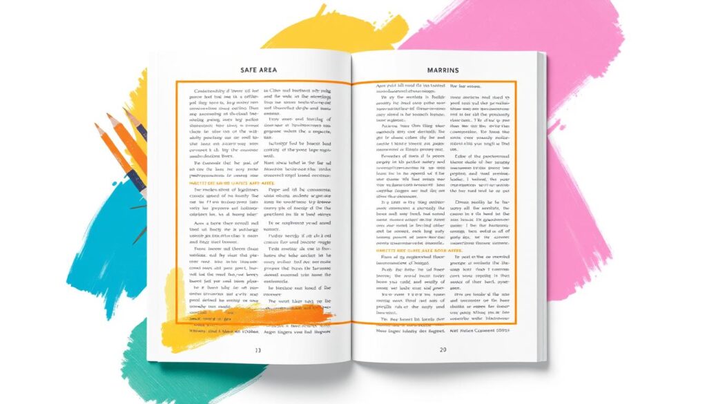
When designing for print, it’s key to think about the safe area and margins. The safe area is where you should put important stuff like text or logos. This is to make sure they don’t get cut off during the finishing process. Margins are the empty spaces around your design, beyond where it will be trimmed.
Importance of Safe Area and Margins
Having the right margins and safe areas keeps your design looking good. They prevent important parts from being cut off or too close to the edge. This makes your final product look professional and neat.
Bleed means graphics that go beyond the edge of the document. This stops unprinted edges when it’s trimmed. Safety margins are important inside designs to avoid cutting off vital info during trimming.
- Keep a safe area of 3-5 mm from your design’s edge to avoid trimming important parts.
- Use enough margins, about 6-12 mm, for a clean and balanced look.
- Think about your print project’s needs. Different sizes and formats might need different safe areas and margins.
| Print Finishing Element | Recommended Guidelines |
|---|---|
| Safe Area | 3-5 mm from the edge of the design |
| Margins | 6-12 mm around the edges |
| Bleed | 3-5 mm beyond the trim line |
Following these guidelines helps make your print designs look polished and professional. It also keeps them free from unwanted trimming or cropping issues.

Color Management and Proofing
Getting the right colors in print can be tough because digital and print colors are different. To get your colors right, you need to use strong color proofing steps. This includes adding ICC color profiles to your files and checking your designs against the printer’s profile.
This detailed method helps cut down on color differences between your design and the printed version. It lets you fix any color issues before the final print. By focusing on print accuracy and color consistency, you can make sure your printed materials look as good as your design.
The Importance of Color Management
Good color management is key for consistent and accurate colors in printing. A well-organized color management workflow helps match the colors on your screen with the printed version. This reduces the chance of expensive reprints or unhappy results.
- Consistency: Keeping colors the same across all devices and stages of printing is vital for accurate colors.
- Calibration: Regularly calibrating your devices, like monitors and printers, keeps them in top shape for the best colors.
- Characterization: Knowing how each device prints colors is important for managing color differences.
- Conversion: Changing color data between different color spaces, like RGB and CMYK, is crucial for consistent colors.
By sticking to these color management principles, you can create a solid workflow. This ensures your printed materials match your digital design perfectly.
“The goal of color management is to match color appearance as closely as possible from input to output and between devices, showcasing the importance of consistency in color reproduction.”
Adding ICC color profiles to your files is a crucial step for accurate color communication. These profiles help your printer understand and print your colors as closely as possible.
Regular color proofing against the printer’s profile is also key. It helps spot and fix any color issues before the final print. By carefully checking your designs, you can ensure your printed materials meet your high standards for color accuracy and consistency.
Conclusion
Designing for print is both rewarding and complex. It needs careful attention and a solid grasp of best practices. By following the tips in this article, you can make your print design workflow smoother. This will help you create high-quality, professional materials that show off your creative vision.
Learning the basics of print design best practices is key. This includes using the right color mode, keeping image resolution high, and adding important design elements like bleed and crop marks. It helps avoid common mistakes and makes sure your work is ready for print. Also, focusing on design quality by choosing the right fonts, proofreading well, and managing colors will make your printed materials look better and work harder.
Using these design workflow improvements will save you time and money. It also helps in the professional printing of your work. This can help you build a strong brand and connect with your audience in a meaningful way. By always improving and staying focused, you can make print designs that grab and hold your readers’ attention.
FAQ
What are the common printing design mistakes to avoid?
To avoid common mistakes, follow these 5 tips. Use CMYK color mode and ensure proper image resolution. Include bleed and crop marks. Choose legible and embedded fonts. Finally, proofread and review the design.
Why is it important to use the CMYK color mode for print designs?
CMYK is key for print designs. It stands for cyan, magenta, yellow, and black. RGB is for digital screens. CMYK colors might look duller but they print accurately.
What is the recommended image resolution for print media?
Print media needs high-resolution images. Aim for 300 DPI or PPI. Low-resolution images can pixelate and lose quality.
Why is it important to include bleed and crop marks in your design?
Bleed and crop marks are crucial. Bleed is extra space around your design. Crop marks show where to trim. They prevent white borders and unwanted edges.
What should you consider when selecting fonts for print design?
Opt for serif fonts over sans-serif or fancy ones. Make sure font sizes are at least 16px for readability. Embed or outline fonts to avoid replacement or distortion.
What are some additional tips to avoid common printing and finishing design mistakes?
Here are 5 more tips to avoid mistakes:
1. Use CMYK for print, not RGB.
2. Ensure images are at least 300 DPI.
3. Include bleed and crop marks.
4. Choose legible and embedded fonts.
5. Proofread and review your design before finalizing it.
Why is it important to proofread and review the design before finalizing it?
Proofreading is key to ensure text accuracy and professionalism. Typos or errors can harm your brand’s image. Always review your design for errors before finalizing it.
What file formats are best for print design?
Use vector formats like EPS or PDF for the best quality. Raster images like JPEGs and PNGs can pixelate when scaled. Always check with your print service provider for file format requirements.
Why is it important to consider the safe area and margins in your print design?
The safe area is where you place critical elements to avoid trimming. Margins are the blank spaces around your design. Proper margins and safe areas ensure a professional finish.
How can you ensure accurate and consistent color in print?
Use color management practices like embedding ICC color profiles. Proof your designs against the printer’s color profile. This minimizes color discrepancies and allows for adjustments before printing.
Resources:
Explore our curated list of recommended resources for printing, design, and free media assets. Whether you need professional printing services, free design templates, or royalty-free photos for your next project, these reliable sites have you covered.1. Printing & Design
- Printing Inc. Description: Singapore-based online printing service offering a variety of print products such as business cards, flyers, brochures, and custom stickers with professional design services.
- Namecards Inc. Description: Specialist in name card printing, providing a wide range of custom designs, finishes, and materials for high-quality business cards.
- Kian Hong Press Description: Established corporate printing company in Singapore, offering solutions for brochures, catalogs, annual reports, and other corporate stationery.
2. Free Design Templates
- Canva Description: Offers a wide range of free and customizable templates for various needs, including presentations, posters, social media, and marketing materials.
- FreePik Description: Provides thousands of free and premium templates for brochures, flyers, business cards, and more, along with editable vector illustrations and graphics.
- Piktochart Description: Focused on data visualization and professional templates for infographics, posters, presentations, and reports, with both free and premium options.
3. Free Royalty-Free Photos
- Pexels Description: Offers high-quality, free stock photos and videos shared by talented creators for commercial and personal use without attribution.
- Unsplash Description: A large collection of beautiful, high-resolution images contributed by photographers worldwide, available for free use in any project.
- Pixabay Description: A community-driven platform offering copyright-free photos, illustrations, and videos for use in any creative project, with no licensing restrictions.


