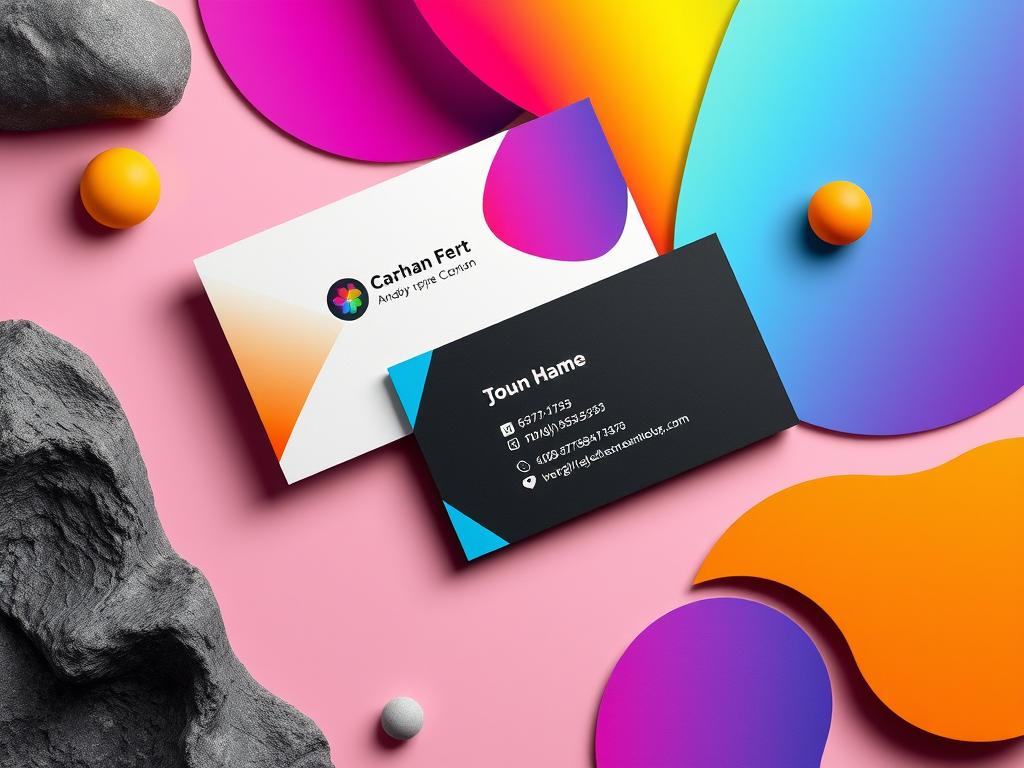
Create Eye-Catching Business Card Design Tips
In Singapore’s competitive business world, a well-made business card can leave a lasting mark. It can help your company shine. You can choose the right materials and add your branding to make a memorable card. Whether you want something modern or unique, these tips will help you create a card that showcases your brand well. Key Takeaways Incorporate your brand’s colors, logos, and fonts to solidify recognition Utilize both sides of the card to maximize space and include additional information Explore unique shapes, finishes, and materials to make your card stand out Ensure clear and up-to-date contact details for effective networking Leverage calls to action and QR codes to drive engagement and digital connections The Importance of Unique and Creative Business Card Design A well-designed business card can make a big impact. Off-the-shelf templates are quick but lack uniqueness. A custom design can make your brand stand out and show professionalism. Differentiate from Templates and Competition Using a template can make you blend in. A unique design helps you stand out. By creating an original card, you show your brand’s personality and leave a lasting impression. Make a Professional and Memorable Impression A creative business card shows your work’s quality and brand values. It can make a strong impression and show your commitment to excellence. By using elements that appeal to your audience, your card will be both beautiful and true to your brand. Standard Business Card Sizes Recommended Font Size Special Finishing Techniques North America: 3.5 × 2 inches Europe: 3.346 × 2.165 inches Oceania: 3.54 × 2.165 inches 8 points is the recommended minimum font size for text on a business card. Embossing Letterpress process Stamping with foil UV spot coating Unique and creative business card designs can make your company stand out. Whether you try new shapes, materials, or finishes, it’s all about showing your brand’s personality and values. This way, you can connect with your target audience. Incorporate Your Branding Elements To make a lasting impression, it’s key to use your brand colors and logo. Using the same colors, fonts, and visuals in all your materials helps people recognize your brand. This approach is crucial for professional and effective branding. Use Brand Colors, Logos, and Fonts Using your logo as the main focus on your business card branding strategies is a smart move. Surround it with colors that match your brand. This makes your company easy to spot right away. Studies show that 85% of business cards use a company logo to show brand identity. Also, 60% of companies choose professional colors over bright ones to look polished on their unique business card designs. The font you choose is also important. It affects how your card looks and reads. Keeping the same font across all your materials helps build strong brand recognition. Think about legibility, brand cohesion, and who your audience is when picking a font. “Utilizing elements like business logos, brand colors, and typography on business cards effectively delivers the core message to potential clients.” By carefully adding your brand’s visual identity, you’ll make a professional business card design. This design will connect with your audience and stand out from others. Include Clear Contact Information When designing your business card, make sure your contact details stand out. A good business card layout should let people easily reach out to you. This way, you’re making it simple for them to connect further. Essential Details for Potential Clients Your full name and professional title Company name and logo Direct phone number Email address Website URL Social media handles (LinkedIn, Twitter, etc.) Adding these important details to your business card branding boosts your credibility. It also makes it easy for people to remember how to contact you. Use a clean layout so all the info is clear and easy to find. “A well-designed business card with clear, up-to-date contact details can make a lasting impression and increase the chances of a successful follow-up.” By focusing on including key contact info on your business cards, you’re taking a big step. You’re working towards building strong connections and possibly opening up new business opportunities. Choose High-Quality Print Materials The quality of your business card design matters a lot. It shows what your brand is about and makes a strong impression. Using top-notch paper and printing makes your unique business card designs pop and memorable. Business cards are often printed on 14 or 16pt stock. Thicker cards, like 18pt or 32pt, are more durable and look better. But, they cost more. The 16pt premium coated matte is the top choice for business cards. It has a smooth finish. Uncoated paper is good for writing and saving money. Coated papers, like matte and glossy, enhance photos and details. Soft-touch finishes feel velvety, while plastic cards are strong and flexible. Choose materials that match your brand’s look and feel. Make sure your font is big enough to read and leave enough space around it. Use CMYK and 300dpi for the best print quality. High-quality materials and professional printing make your business card designs unforgettable. They help build your brand’s credibility and professionalism. Utilize Both Sides of the Card Don’t overlook the back of your business card. It’s just as important as the front. By using both sides, you can share more about your business without losing the unique business card design. Think about adding your social media links on the back. This makes it easy for people to find you online. You can also add icons or illustrations that show what you do. Additional Information and Creative Elements The back of your card is a chance to get creative. You can include helpful tips, fun facts, or cool graphics. This can really grab your audience’s attention. But, make sure everything on the back is easy to read and fits your brand. You want your card to look good and make a strong impression. Trend Adoption Rate Key Considerations Double-Sided Business Cards Increasing Utilizes minimal space efficiently Incorporates more information like coupons or … Read more


